Someone asked me how to change the color of a bar graph in an Excel sheet, and I thought I’d write a quick post about it since it is a fairly straightforward thing to do.
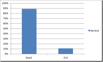
Say you have a bar graph which displays two parameters – Good and Evil, and Excel throws up a graph like this:
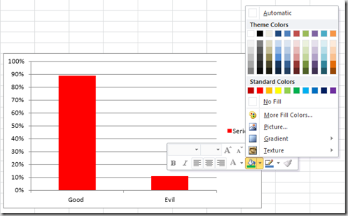
Now say you want to change the color of these two bars to green and red. The guy who asked me about this was right clicking on a bar, and then selecting a color from the “Shape Fillâ€. The trouble was that it was coloring both the bars like this.
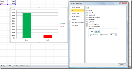
Instead of this – double click one bar, and it will open up the “Format Data Point†dialog. Next select “Fillâ€, and then “Solid Fillâ€. Select the color you want from there, and it will only color the bar you have selected.
It just takes a few seconds, once you know it, but knowing it sometimes takes a few hits and misses.


