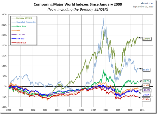
Here is an interesting little chart that compares some of the world’s major indices since the beginning of 2000 till date.
I looked at the green worm go, and thought that it looked like India, and so it was too. It’d be interesting to see how EPS for these countries grew over this time period; I’ll see if I can put something together.
Courtesy dshort via Big Picture

