The Economist published a cheekily titled article – “Hello America†a few days ago. It showed a graph of the history of world GDP, and showed the share of different countries over a very long timeline.
I was a little surprised to see that China and India had so much of the global share for such a long time, but didn’t give it much thought because these are absolute numbers, and I felt what would have really been interesting would be a comparison of per capita GDP.
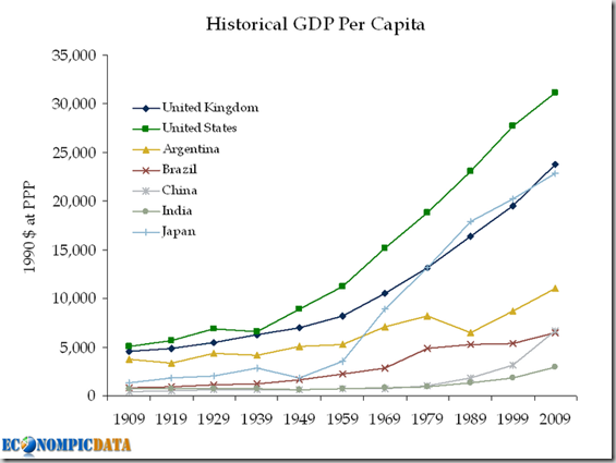
I had quite forgotten about it, but today I saw Econompic Data publish such a chart.
Look at those US, UK and Japan lines go – amazing right? Funny thing is that US is not even in the top 5 countries when it comes to per capita GDP.
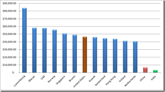
Here is another chart I made from 2009 World Bank data (Wikipedia) that shows the per capita GDP of some of the top regions.
I was expecting to see Finland there somewhere, only because they made broadband a legal right some days ago!, but they are at 21 in this list.


Very interesting. I followed your Wikipedia link and had a look at the CIA’s estimates – I think these may be more realistic as several tax havens then appear high in the table. e.g. Liechtenstein ($122,000 GDP per person despite having no oil etc or major industries – more than double the USA’s estimate), Jersey and the Caymans.
The weird thing about the CIA numbers is that they are for different years, but I think the tax haven point is quite interesting….a country barely 62 square miles, and 35k people, and has the highest GDP in the world! That’s something now. Let me see if I can dig up some more info on this.